Choropleth maps (also called areal density maps - e.g. population density maps) are a common means of presenting research results visually. There are a number of variables that influence the appearance of the map, including the type of projection, the scale, the centre of the map and the colour scheme. Gabriela Molina León and Michael Lischka, in collaboration with Andreas Breiter, conducted a survey to find out which variants of thematic maps social scientists prefer for their work. For this purpose, the 20 participants had the opportunity to customize a thematic map according to their needs and preferences using the variables mentioned above.
In a short interview, Gabriela Molina León and Michael Lischka explain their findings, which they presented on 28 October 2020 at the IEEE Visualization Conference (a preprint version of the article, which will be published in the Conference Proceedings, is available here).
The most popular world maps - at least in Europe - use the so called Mercator projection. It was invented in the mid-16th century, and is still widely used today (with some variations) e.g. in news programmes. Is it time for a new type of world map if it comes to social policy research?
Michael Lischka: It's not time for a new kind of world map, but you should be sensitive to the properties of a map if you understand it as an information medium. Every map is an attempt to depict a three-dimensional object (globe) in two dimensions. A direct transfer of all properties is simply impossible, so every world map projection is a compromise. Accordingly, better or worse decisions can be made depending on the purpose of map use. Basically, one can distinguish between maps that preserve one of three properties at a time: areas (equal-area projections), angles (conformal) or distances (equidistant). Since we were not concerned with distance measurements at any point, we excluded equidistant maps from the beginning.
Conformal projections make sense when it comes to navigation. In small map sections, angle and area fidelity are almost identical to reality. This is a great advantage especially for route planning (e.g. google maps), road maps, air and sea traffic. But on a global level you see strong size distortions. Since you just mentioned Mercator: This projection represents spatial units larger the closer they are to the poles. Thus, Russia, Canada, the USA, China and Europe appear to be much larger. Especially since Europe lies in the centre of the representation and thus appears dominant compared to Africa. This may also make sense in a Eurocentric news coverage. Some news formats even have sections like "Europe and the World". But such a projection cannot be used for research that includes countries of the 'Global South' on an equal footing. At least not if maps are used as an information medium to disseminate knowledge. Projections offer a perspective on the world.
For choropleth maps, equal-area projections are generally recommended. Can you briefly explain why?
Lischka: Equal-area maps correctly represent the size of land masses and spatial units. On the negative side, the shape of the land masses inevitably get distorted. But if you colour countries based on certain data without showing their correct area, you lose the possibility to compare countries regarding the density of the shown variables. The representation of the correct relative areas is therefore an essential property of maps to be able to make reliable comparative statements between world regions and countries. The simplest examples are population density, forest coverage and agricultural use. Information of this kind on maps that are not true to area can lead to misinterpretations by the viewer.
Since equal-area maps can distort countries to such an extent that they cannot be recognized, maps that strike a compromise between area size and shape are often used. For example, the Winkels-Projection, which is used in German school atlases. World maps of this kind offer both area fidelity and the recognition of spatial units due to their shape.
You studied the preferences of social scientists. How does their favourite choropleth map look like and why?
Lischka: For their own research projects, the Equal Earth projection was the dominant choice among the social scientists that participated in our study. They had a whole conglomerate of reasons – ranging from 'aesthetically appealing' to 'looks right', 'true to form' and 'true to area'. In the end, the first task of our study aimed at the individual needs of the researchers. Some of them focused their research on certain regions of the world, so they used the zoom function and paid close attention to the recognition of the respective region.
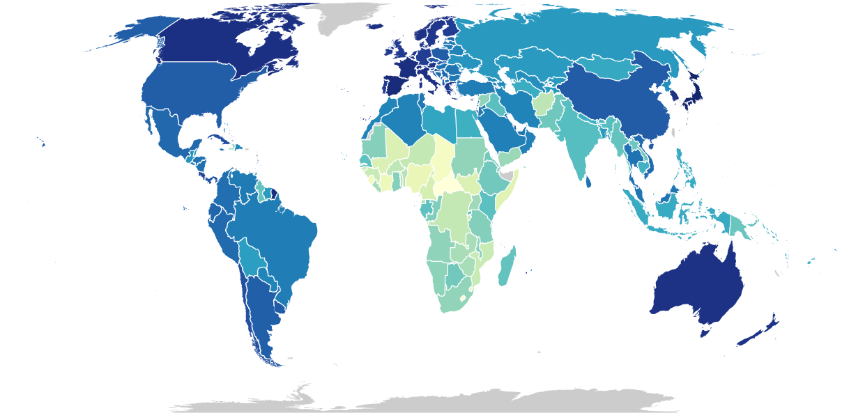
Figure 1. Choropleth map of the world, using the Equal Earth Projection
For the best presentation of research on the Global South, the Gall-Peters projection prevailed in our study, but only by a narrow margin. Actually, the distribution was very balanced. This small deviation is probably due to the instructions for task two we gave the participants and the claim to the map mentioned there. Gall-Peters most obviously distorts the country shapes and shows a rigorous coordinate system that demonstratively suggests fidelity to the area size. The researchers did not know that all projections that we offered them were equal-area and thus decided 'in the sense of objectivity', partly against aesthetic convictions and recognition value.
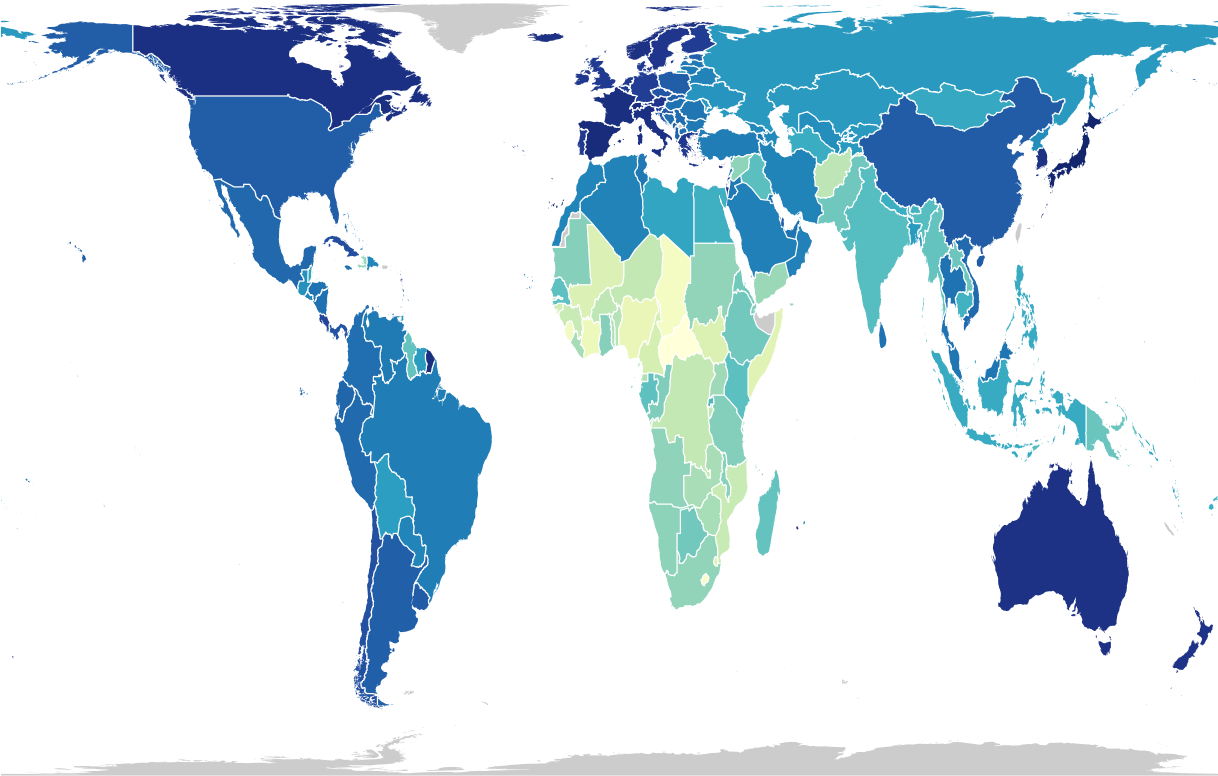
Figure 2. Choropleth map of the world, using the Gall Peters projection
It is not only the type of projection that makes for a "good" choropleth map of the world - what about colours?
Gabriela Molina León: There are well-known tools that recommend and let you test multiple colour schemes for choropleth maps, such as Color Brewer. Therefore, we selected the five colour schemes of our study according to its recommendations.
Since the choropleth map of our study visualised life expectancy data, we used sequential scales. When choosing a colour scheme, the data determines what type of scale fits best: if the visualised variable encodes two opposite directions (e.g. negative and positive temperature values), then a scale with diverging colours (e.g. from dark red to dark blue) is most suitable. If the data is categorical, a categorical scheme is recommended.
For the case of sequential scales, it was recently confirmed that readers tend to associate darker colours with higher values, so we favoured colour schemes that follow this association.
What were the colours of choice among the scientists you worked with?
Molina León: The yellow-green-blue colour scheme (YlGnBu, available at https://observablehq.com/@d3/color-schemes) was the most common scheme chosen. From the 40 maps created by the researchers, 23 used this scheme.
Interestingly, they mentioned something in their reasoning that we did not expect: They wished for a gray colour scheme (or one that would look good in grayscale) because they often do not have the option to use colours in their publications.
Contact:
Michael Lischka
Gabriela Molina León